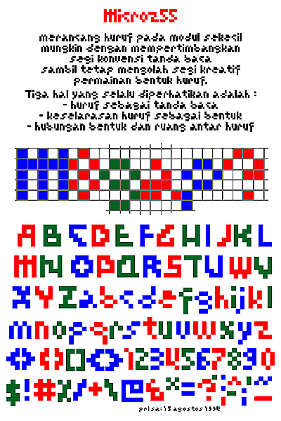
Priyanto Sunarto, Typography “Microza”, 1994
•••
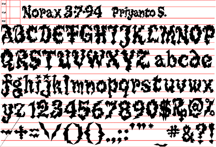
Priyanto Sunarto, Typography “Norax”, 1994
•••
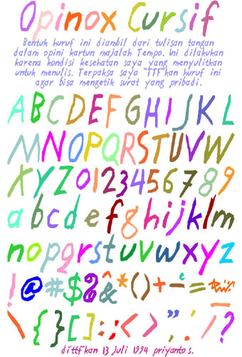
Priyanto Sunarto, Typography “Opinox”, 1994
•••
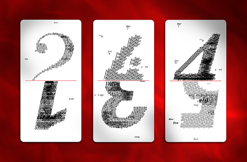
Bambang Widodo, Typography “Domino Type”, 1998
School Project
Digital output mounted on balsa wood
This was one of the assignments for typography class. We were asked to reconstruct the visual treatment of conventional domino cards using typography. Shown here are some of the cards.
Source: javaloca’s photos
•••
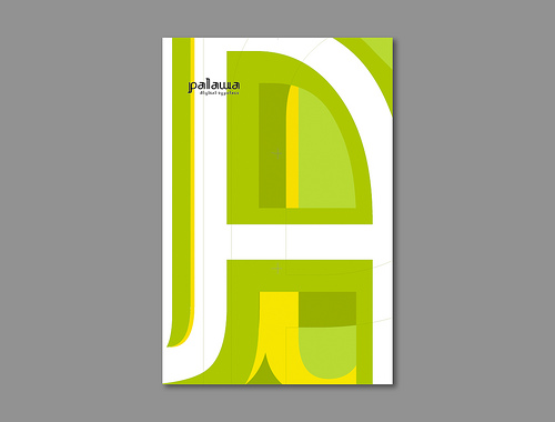
Palawa
Font Design
Unfinished project in progress
“Palawa” fonts are inspired by ancient Javanese script which later I found out has long history with Tamil script writing. I was also inspired by the fluidity and strokes of batik motifs and patterns. The project was submitted for my thesis project but still on going until now trying to fine tune the whole set.
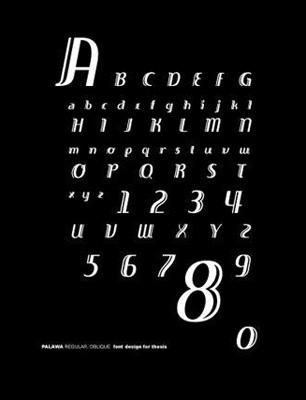
Bambang Widodo, Typography-Font Design “Palawa”, 1998-1
. . . . . . . . . . . . . . . . . . . . . . . . . . . . . . . . . . . . . . . . . . . . . . . . . . . . . . . . . . . . . . . . . . . . . .
Bambang Widodo, Typography-Font Design “Palawa”, 1998-2
Palawa script and regular.
. . . . . . . . . . . . . . . . . . . . . . . . . . . . . . . . . . . . . . . . . . . . . . . . . . . . . . . . . . . . . . . . . . . . . .
Bambang Widodo, Poster “Palawa”, 1998
A poster for a set of Palawa typeface I try to create, 11 x 17 in.
More posters by Bambang Widodo: Posters (2000-2009)
Source: javaloca’s photos
•••
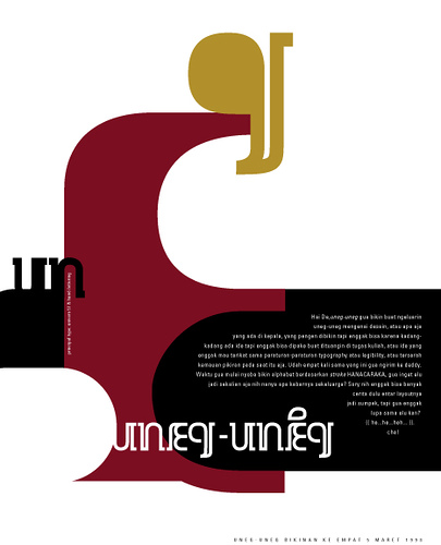
Uneg-uneg
Personal Letters
8.5 x 11 inch each
Digital output
During my graduate study abroad, I kept in touch with friends in Jakarta and created these series of personal letter called “uneg-uneg,” which basically my explorations in designs, typography, and things that crossed my mind. Shown here are three of them.
Bambang Widodo, Typography “Uneg-uneg”, 1998-1
This experimental typography was the beginning of my series of typeface design called “Palawa”
. . . . . . . . . . . . . . . . . . . . . . . . . . . . . . . . . . . . . . . . . . . . . . . . . . . . . . . . . . . . . . . . . . . . . .
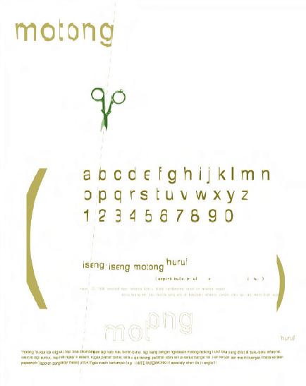
Bambang Widodo, Typography “Uneg-uneg”, 1998-2
Source: javaloca’s photos
•••
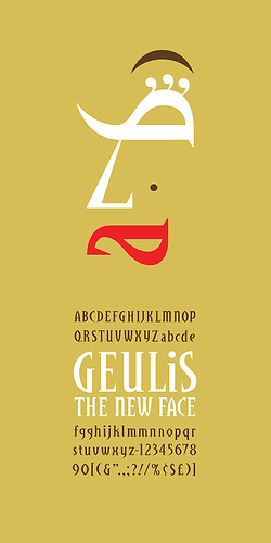
Geulis | 1998
Font Design
School Project
Digital output
I submitted two proposals of masthead designs for fictional magazine called “SCI” (Stands for Science, Culture and Ideas). Tony DiSpina, my professor at that time picked one and challenged me to design the whole alphabet for the other one. I took that challenge and produce this concept of font called Geulis. And yes, its from Sundanese language.
Bambang Widodo, Typography “Geulis”, 1998
Source: javaloca’s photos
•••
Kero | 1999
Font Design
Personal Project
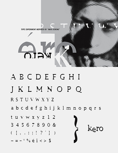
Bambang Widodo, Typography-Font Design “Kero”, 1999
Source: javaloca’s photos
•••
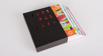


 1. Nirmana: Elemen-elemen Seni dan Desain | Sadjiman Ebdi Sanyoto
 2. Desain Komunikasi Visual Terpadu | Yongky Safanayong
 3. Hurufontipografi | Surianto Rustan
 www.underconsideration.com

[…] different font. This experiment inspired me to create another set of font called “Kero.” See: Typography (1990-1999) for that […]
[…] Check out more of Bambang Widodo’s Fonts in Typography (1990-1999) […]