
By Ismiaji Cahyono | [email protected]
Exploiting Crisis & Countering It
Since May 1998, after Suharto’s 32 years of authoritarian rule was replaced by the “Reformation” government, transformations – democratization, liberalization of the media, and decentralization of the government – took place in Indonesia. However, powers disadvantaged by the changes staged instability through violent and discriminatory aggressions.(1) Making matters worse, since 1998, incessant natural disasters overwhelmed Indonesia, culminating in the 2004 earthquake and tsunami off the coast of Aceh that killed hundreds of thousands in the region. The mass media appropriately took on the role of communicating those events, disseminating vivid, lurid, and horrific images of violence and tragedy – unfiltered, insensitive, and unrestricted – accumulating to be a routine and daily visual consumption for Indonesians. This was understandable at first, but prolonged it became tiresome, repetitive, depressing, suspicious, and provoking more hate.
I was fed up with the Indonesian mass media’s abuse and exploitation of crisis, tragedy and violent crimes, particularly its treatment on discriminatory and racial crimes against Indonesia’s ethnic and religious minorities (I am an ethnic minority and experienced those discriminations). Instead of remaining neutral the mass media perpetuated more hate and violence. The “Mandala of Difference” project was to counter such exploitation, with a sensitive approach to treating and communicating tragic and violent information. I wanted to advocate tolerance through an elegant presentation that respects differences and motivates hope and dialogue between oppositions. The mandala was my voice, as a graphic designer, a “hamstrung” social and political potential as described by Maud Lavin.(2) Pluralism is an asset, not a path to destruction, and thus differences must be respected, discussed, recognized, and acknowledged.


Identifying the Mandala
To me, countering implied opposing. Using the principles of opposites, I started listing oppositional terms the mass media often expressed in reporting news related to racial crimes, religious conflicts and disasters. I mapped them out, connecting opposing terms by placing them side-by-side on a matrix diagram, based on how they correspond to one another. For example, “tolerance” was a keyword in religious conflicts, corresponding to “hate” and “difference” (which had more frequency of usage). Interestingly, the matrix diagram was similar to the Balinese poleng, a checkered pattern used as holy ceremonial decoration that symbolizes the co-existence of negative and positive principles in the world – how one without the other cannot exist. I found this to be a potent visual expression.
Thinking about oppositional terms, I recalled Homi Bhabha’s engagement with polarity and hybridity.(3) Bhabha proposed a new space of thought, a hybrid born out of the marriage of reciprocities of opposing poles (binaries) that dominate modern discourse. The harmonious poleng matrix was born out of opposites; it was a perfect expression of the new space Bhabha proposes. The poleng was also similar to the mandala diagram frequently used in Hindu-Buddhist traditions. To C.G. Jung, the mandala was the individual psyche’s device to organize its disordered and irreconcilable elements, an attempt at self-healing from nature.(4) Jung implied that the Mandala was an individuation device, beyond the confines of culture and community. However, in Hindu-Buddhism, the mandala was used both as an individual and communal device, the means to bring communities together as a holistic and teaching medium. It was a reflection of the world, nature and the spirit, all world components co-existing in a harmony.(5)
Aspiring to pluralism in a complex and diverse geography such as Indonesia was challenging.(6) Implementing the mandala seemed neutral enough because Indonesia had a Hindu-Buddhist root that has been assimilated into Islam.(7) With the mandala it was possible for me to incorporate the opposing text I mapped with illustrations, geometric shapes, symbols, or icons. The mandala was the hybrid medium because it was a discursive space that acknowledged differences on equal terms; each element coexists and is engaged in dialogs, creating a harmony.


The Mandala and Its Travels
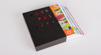
“The Mandala of Difference” is a series of folded brochures measuring 9 X 9 cm (closed) and 27 X 27 cm (opened). It folds out revealing terms to opposing terms, and finally exposing a mandala diagram composed of distinctly Indonesian icons, ornaments, patterns, geometric shapes, and colors, each having its own symbolic meaning pertaining to the relevant ethnic and religious groups in Indonesia. The eclectic composition of different images emphasizes coexistence, where differences exist and reciprocate to create harmony.
I simplified the matrix of terms into 3 columns by 3 rows for efficient communication. The smaller number of matrixes made it possible for the campaign to appear in consecutive series. On the mandala side, the eclectic elements were composed in a concentric order, and were given a subtly contrasted color, enough so that each element may be easily recognized. The colors were drawn from various traditional Indonesian textile colors. The process of folding out was integral; I wanted the mandala to be discovered and uncovered, instead of presenting it already opened and revealed. The fold also maintains flow, direction and legibility of information. The mandala was to be printed as traditional brochures. However, the attractiveness of its design had a potential for it to be expressed as something to be worn, as a scarf, or wrap (sarong), as suggested by my peers. It made sense, because a textile medium has the potential to reach larger audiences.
“The Mandala of Difference” is a work progress, and I am currently exploring new visual possibilities for it. I have yet to print the brochure and plan to have it distributed in an interventionist manner by leaving it in a public venue to be picked up randomly by passersby, or by handing it out on sidewalks. I have proposed the mandala to Yayasan Interseksi,8) a private, non-profit organization advocating multi-culturalism in Indonesia. I am glad that the mandala was posted in their website as a flash animation presentation while I was in the process of lobbying the organization to print and distribute it. The mandala was also posted in the website of an Indonesian Christian youth organization called Keong Mas, which advocates pluralism.9) In June 2006, a curatorial board accepted the mandala to be exhibited in Jakarta during the Petasan Grafis graphic design exhibition at the National Gallery. And in July 2006, the mandala was presented to FDGI & Friends, an Indonesian graphic design forum talk. Reactions on the project were curiously reserved to the method of research and visual form, while I expected a more engaging discussion on the framing and issues contextualizing the project. I hope to finalize its designs, for the campaign is necessary to enrich discussions on pluralism, a critical issue that has been overly abused and exploited. It deserves to be addressed intellectually and acted on socially.


![]()
(1) The previously tolerant city of Ambon and Poso experienced escalating religious conflicts; ethnic war between the indigenous Dayaks and the Madurese emigrants occurred in Sampit; civil war transpired in the province of Aceh and Papua, between Indonesian nationalists and separatists, causing thousands of civilian deaths; and Jakarta and Bali became the target of terrorist bombings.
(2) See Lavin, Maud. Clean New World: Culture, Politics, and Graphic Design. Massachusetts: MIT Press, 2001. P. 6.
(3) Read Bhabha, Homi. “The Commitment to Theory.” The Location of Culture. London: Routledge, 2004. P. 32.
(4) See Jung, C.G. Mandala Symbolism. New Jersey: Princeton University Press, 1973. P. 4.
(5) See Thurman, Robert A.F. Mandala: the architecture of enlightenment. Boston: Shambala, 1998. P. 131.
(6) Indonesia has about 300 ethnic groups, 500 languages, 5 religious groups, and spread throughout more than 13,000 islands.
(7) Mandala diagrams represented by concentric geometric ornaments were popular in Indonesian Muslim ornaments.
(8) http://www.interseksi.org
(9) http://www.fica.org/keongmas
Sources
- Bhabha, Homi. “The Commitment to Theory” The Location of Culture. London: Routledge, 2004.
- Lavin, Maud. Clean New World: Culture, Politics, and Graphic Design. Massachusetts: MIT Press, 2001.
- Jung, C.G. Mandala Symbolism. New Jersey: Princeton University Press, 1973.
- Thurman, Robert A.F. Mandala: the architecture of enlightenment. Boston: Shambala, 1998.
![]()
Related article:
DGI Online Exhibition #01: Ismiaji & Citra
Mandala of Difference
•••


 1. Nirmana: Elemen-elemen Seni dan Desain | Sadjiman Ebdi Sanyoto
 2. Desain Komunikasi Visual Terpadu | Yongky Safanayong
 3. Hurufontipografi | Surianto Rustan
 www.underconsideration.com

Sialan! koq bagus banget sich? Mau tanya, apakah kartu diperbanyak? Kalo iya, dimana saya bs mendapatkan? terima kasih
dijadiin bonus utk majalah ‘VS’ (versus) nyah duonk! huehehe… dasar muke gratisan. =P
Pak aji, I amazed with your concept. It’s been long time since ‘reform’ word mutantly change to ‘deform’. Salute you!
Konsep yang sangat matang, desain yang sangat berkualitas…
local to global..its real…good job
regards,
There are something strikingly solid about the way you guy deliver this Mandala. Both delivery and the content are on the ball. Thanks for sharing this.
keren!!!!!!!!!!!!!!!!!!!!!!!!!!!!!!!!!!!!!!!!!!!!!!!!!!!!!!!!!
somehow, gue ga suka semuanya tuh…
kalo konsepnya sih suka.
nice !!
good design, great creativity, and high impact! Mungkin inilah yang spt dkatakan om Hermwan Tanzil. seringkali kt ‘miss interpretation’ bhwa desain yg mggunakan kearifan lokal/etnik Indonesia di klaim sbg gaya desain LeBoYe.Pdhal mnrt beliau Desain yang memakai unsur tradisional adalah milik siapa saja!
And..creatively, Mr. Ismiaji Cahyono can get out from this !
Salute, tp ne design hrs jd bonus mjlh VERSUS.. : )
Semoga semakin arif dlm membangun DGI..
wah keren nih…. konsepnya juga mantap…
bentuk yang ajaib penuh nilai kehidupan bermasyarakat… dan design yg ciamik…
nggak ngerti…..ko bisa keren…!?
bagus banget! tapi ekletiknya dimana?….kan aku baru cari indonesian eclectic
saya jadi pengemar mandala berkat Aji ! luarbiasa ….
an option - cd/vinyl cover? be it folded, or spread out. the mandalas, not the texts.
Terima kasih atas dukungannya teman-teman. Ini merupakan proyek yang tak kunjung selesai. Hingga sekarang sayapun masih mengembangkannya. Foto-foto proses melipat di atas merupakan prototipe pertama. Mandala ini sempat saya cetak di atas kain sutra yang transparan, menarik jadi selendang bukan? Di dalam perkembangan barunya saya menemukan bahwa semakin ‘eklektik’-nya peleburan motif yang beragam dari seluruh Indonesia, semakin kabur dan netral imaji yang tercipta. Sangat menarik! Bagi yang tidak setuju akan olahan visualnya, saya berterima kasih atas komentarnya. Saya makin senang bila karya itu menimbulkan pro dan kontra, karena dari benturan itu terjadi dialog yang bisa memperkaya perjalanan karya ini. Bila ingin hubungi saya secara pribadi untuk membahas kelanjutan, atau tambahan kritik serta komentar, silakan hubungi: [email protected] “Constructive differences.” Bukankah itu yang layaknya kita junjung di era yang makin majemuk ini?
Salam,
Aji
Cool stuff, full of inspiration..
saya motion designer pak, mohon ijin untuk bikin motionya ya pak.. ngk di pake untuk komersial kok, hanya untuk performing visual arts..
regrds
B+
thanks Aji & Pak Hanny yang sudah menampilkan ini di DGI. Juga semua temen-temen yang berkomentar baik yang suka, tidak dan bingung

Usul untuk menjadikan bonus di Majalah versus juga harus kita pertimbangkan nih, nanti kita diskusikan di dalam, semoga ada jalan untuk mewujudkannya ya
salam,
oline
excellent…
nice concept
setuju banget tu k4rna idenya, hehehe…
salam nirmana…nirmana indonesia. sip
- koskow, jogja -
apik mas..
menjawab kebutuhan
Aih! Aih! Aih!! Terpana nih! Keren banget deh!
Bagus juga topiknya, anti SARA.
Jarang sih yang ngangkat topik ini, biasa kan.. narkoba-global warming-aid-dll…
Boleh pasang ga di forum? Di forum-forum juga sering terjadi SARA sih…
Makanya INI TUH BAGUS!
bagus! i like it
Hello, saya sangat terbuka untuk berkolaborasi. Mungkin kita bisa bicara di forum lain. Email saya seperti yang telah tertera, terima kasih!
Salam,
Aji
Terima kasih semua, sekali lagi! Kalau seri baru rampung saya segera upload lagi.
kerennnnn abisssssss!!!!
konsep yang matang berpadu visual yang gamblang.
viva desain indonesia!.
jangkrik, apik tenan iki design-ne
[…] Cahyono & Citra Lestari, Social Campaign “Mandala of Difference“, 25 X 25 cm (mini brochure) / 65 X 65 cm (display), […]