By Marryellen Mcfadden
1896
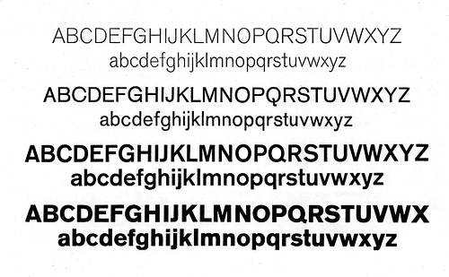
Akzidenz Grotesque in different weights 1896 and later. As far as I know, the Swiss Berthhold typefoundry still carries this pioneer type face. It also comes in condensed and expanded versions in different weights.
Source: flickr
Akzidenz Grotesque/Grotesk is a realist sans-serif typeface originally released by the H. Berthold AG type foundry in 1896. It was the first sans serif typeface to be widely used and influenced many later typefaces such as Adrian Frutiger’s 1957 typeface Univers, and Bauer and Baum’s Folio. Especially Max Miedinger at the Haas Foundry used it as a model for their typeface Neue Haas Grotesk 1957, in 1960 named Helvetica, but sought to refine the typeface making it more even and unified. Contemporary versions of Akzidenz Grotesk descend from a late-1950s project, directed by Günter Gerhard Lange at Berthold, to enlarge the typeface family, adding a larger character set, but retaining all of the idiosyncrasies of the 1898 face. Some new weights, condensed and extended widths were released under the title Standard.
Akzidenz is sometimes at first glance mistaken for the Helvetica or Univers typefaces. The similarities of Helvetica and Akzidenz are apparent, but the subtle differences include the uppercase and lowercase C and the uppercase G, J, R and Q. Aside from the subtle differences in these individual letters, Miedinger’s primary change to Akzidenz is Helvetica’s higher x-height, the distance from the baseline to the height of the lowercase letter x. The general effect is that Helvetica appears more oblong while Akzidenz maintains circular counters and bowls. Both Helvetica and Univers are more regular and have a greater consistency of stroke weight.
Source: Wikipedia
![]()
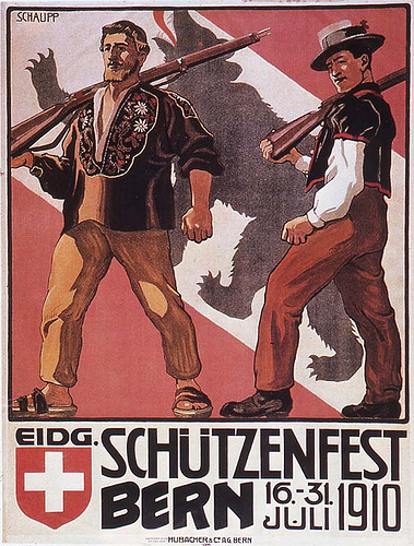
1910
Source: flickr
![]()
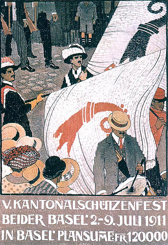
1911
A shooting festival in Basel. Designed by Burkhard Mangold 1911.
Source: flickr
![]()
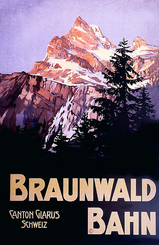
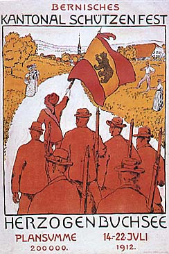
1912
Source: flickr
Designed by Cuno Amiet 1912. During the latter part of the nineteenth century, Switzerland, due to its mountainous terrain, difficult geography and a population who spoke four different languages, promoted country wide activities to help tie its citizens together with a sense of Swiss nationalism. A variety of Swiss government competitions and contests such as marksmanship skills required posters promoting the events throughout the country. (No television or radio in those days.)
It was out of this national effort supporting clear, visually attractive graphics that the Swiss contemporary design movement eventually devoloped.
Source: flickr
Poster promoting Swiss tourism, a new industry for Switzerland 1912.
Source: flickr
![]()
1914
Designed by Wilhelm Berger 1914. Switzerland commissioned a number of posters promoting tourism as well as national Swiss events, in a time when the popularity of alpine hiking and mountain climbing was developing in Europe before WWI. The use of san serif letterforms tightly packed is a part of the growing use of letterform as a design element. It still has a long way to go to the contemporary Swiss poster design! But how quickly times and visuals change.
This is designed on a horizontal layout, unusual for an early Swiss poster.
Source: flickr
![]()
Switzerland had survived WWII as a neutral country (along with Sweden) and a group of Swiss designers, who had been developing fresh, new, concepts of design from the 1930’s on, now came onto the center stage of International graphic design.
After the war, the Swiss Haas type foundry commisioned Max Miedinger to refine and upgraph their older Akzidenz Grotesk fonts and they marketed the revision as Neue Haas Grotesk ( San-serif type faces go by the name Grotesk in Europe). Around 1958 the German D. Stempel AG typefoundry bought it up and introduced it as Helvetica and the rest is history. I have read that Miedinger died a bitter man as he only received a flat fee for the original redesign.
Source: flickr
A version of display san-serif type.
Source: flickr
![]()
1923
Swiss travel poster by Otto Morach 1923.
Source: flickr
![]()
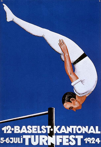
1924
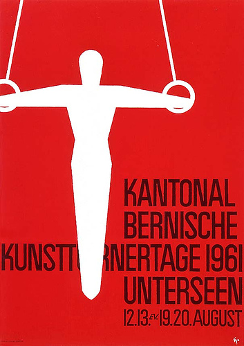
Swiss gymnastics poster by Nicklaus Stoecklin. The outside edges create a tension with the placement of the figure with no background.
The white, san-serif letterforms set tightly in the lower section of the design gives added visual impact.
Source: flickr
![]()
1927
Soiurce: flickr
![]()
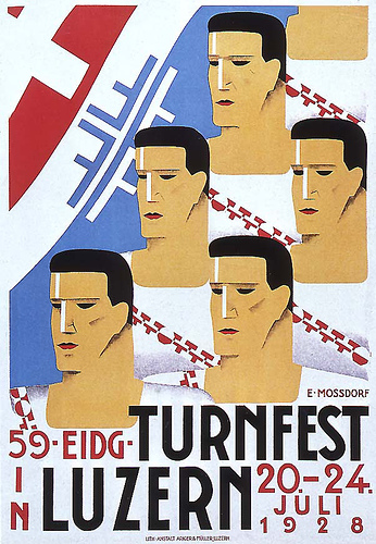
1928
Source: flickr
An early Swiss travel poster designed by Herbert Matter 1928.
Source: flickr
![]()
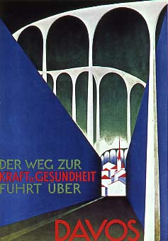
1929
Swiss travel poster designed by Otto Morach, Zurich, 1929.
THE WAY TO
STRENGTH and HEALTH
LEADS OVER
DAVOS
Note: Davos is an important health spa, where especially childeren with astma from all over Europe went to, because of the clean mountain air.
Source: flickr
![]()
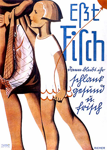
1930
Designed by Walter Riemer 1930. The message is to “eat fish”. Today the message would be “don’t eat fish”.
Source: flickr
![]()
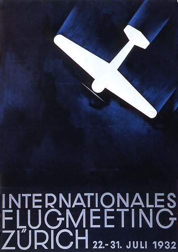
1932
Designed by Otto Baumberger 1932 for an air show.
Source: flickr
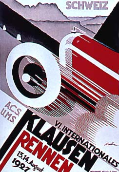
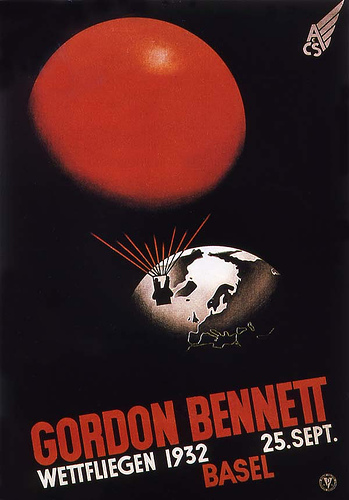
Designed by Fritz Buhler 1932. An announcement for the Coupe Gordon Bennett hot air balloon competition.
Source: flickr
![]()
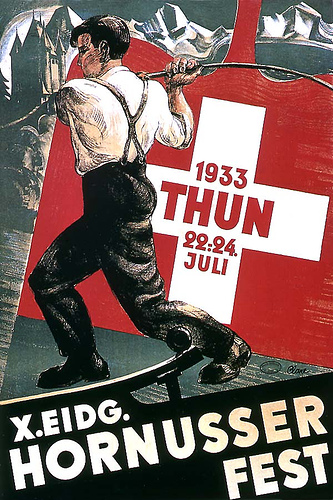
1933
A Swiss Hornusserfest poster 1933.
Source: flickr
![]()
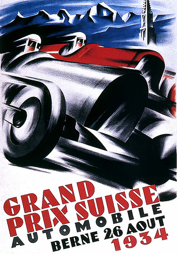
1934
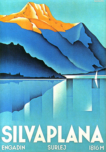
H. Handschin, designer of this very elegant Swiss travel poster. 1934.
Source: flickr
Poster designed by Kasper Ernst Graf 1934. This was an early introduction to using design elements creating motion blur. His work was influenced by Futurism and Art Deco.
Source: flickr
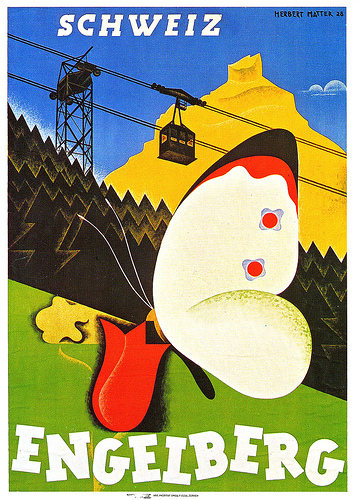
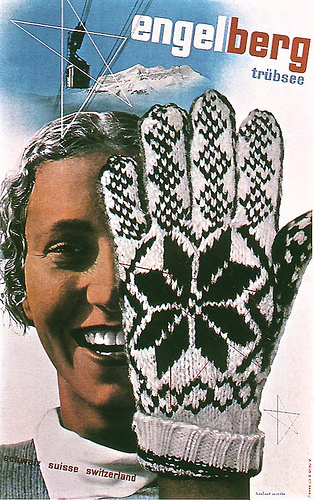
Herbert Matter, Swiss designer of this unique poster for Engleberg 1934, had studied art in Paris and worked designing type and doing photography for Deberny and Peignot typefoundry and also had assisted Cassandre with his poster work.
Source: flickr
Herbert Matter designed this now classic Swiss travel poster in 1934. He combined black and white photography with tone, airbrush color on the Swiss crosses and a layout that creates a sense of a dynamic sport.
Source: flickr
![]()
19..
A contemporary black letter was a simple, modern designed letterform solution that reads well.
Source: flickr
![]()
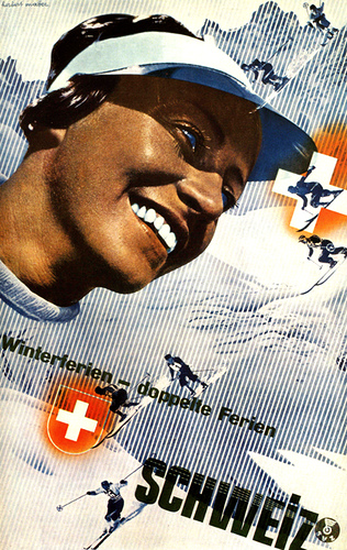
1935
“For nice cartrips: Switzerland”
Swiss Tourist Office poster by Herbert Matter 1935. The dramatic use of photography and illustration combined with san-serif type created a powerful visual.
Source: flickr
![]()
1939
A pre-WWII Swiss sports poster 1939. I didn’t realize until I went to Switzerland how militant the Swiss are. They had heavily armed border guards (at least at that time) and I read that they had all kinds of missile sites designed under such obscure places as false tree stumps. Well, it makes a good story, and maybe things have changed by now. I did learn that neutral doesn’t mean passive.
Source: flickr
![]()
1943
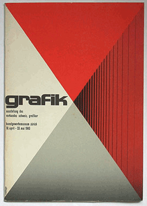
Exhibition of the Association of Swiss Graphic Designers
Ausstellung des (exhibition of the)
Verbandes schweiz. Grafiker (association of swiss graphic designers)
Kunstgewerbemuseum Zürich
18. april - 23 mai 1943
Source: flickr
![]()
1955
Joseph Müller Brockman 1955 design in the series for concert posters for the Tonhalle Gesellschaft Zürich.This is one of the first posters in a series that he designed for the Tonhalle Gesellschaft Zürich that truly exemplified the New Graphic Design approach. It was like a design tsunami sweeping over the international graphic design community.
J. Müller-Brockman was the author of “The Graphic Designer and His Design Problems”, republished in English in 1983 by Hasting House Publishers. ISBN 3 7212 0027 6.
Source: flickr
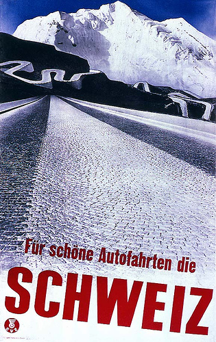
Auto Club of Switzerland poster designed in 1955 by Josef Muller-Brockmann. The Swiss, German and Italian designers were going a whole new direction away from American advertising art and we were stunned by their work.
Source: flickr
![]()
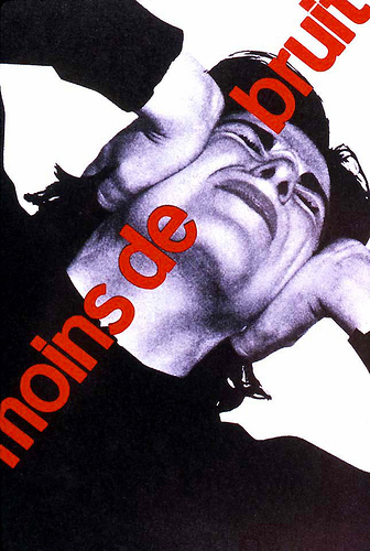
1955-1960
Joseph Müller Brockman poster for noise control. I may later find the date on this but as I remember between 1955 and 1960.
Source: flickr
![]()
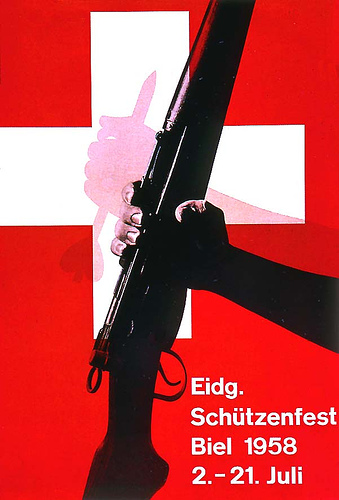
1958
Eugen and Max Lenz sports poster 1958.
Source: fickr
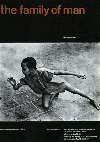
Poster announcing the Family of Man photography exhibit, designed by Joseph Müller-Brockman 1958.
Source: flickr
![]()
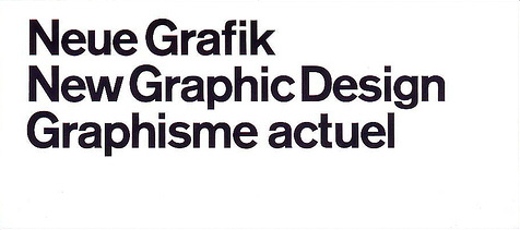
New Graphic Design
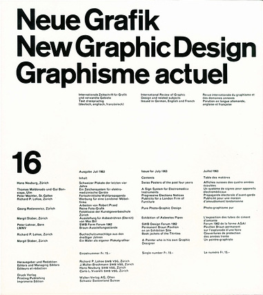
The publication that changed contemporary graphic design and our lives as designers. There is a grid system developed for the whole publication that was never deviated from through the 18 issues.
My set has crossed the Atlantic and US three times (not counting the many moves that I made in the US) and is getting a little worn, especially after 45 years of use by myself, my husband, and my students.There is no colored edge. I just used a colored background to accent the white, black design.
New Graphic Design (also called Neue Graphik depending on where you were) was a magazine series of 18 issues published in Zurich, Switzerland for the international publication market from 1958 to 1965 and it was unlike anything that we had ever seen. It was the new age manifesto for the design world and it was seminal in its influence on international graphic design after WWII.
The four editors were Swiss designers Richard P. Lohse, J. Müller-Brockman, Hans Neuburg and Carlo L. Vivarelli who had formulated new theories of just what exactly design was and how it functioned in the contemporary world. Working together on their concepts in Zurich during WWII (Switzerland was neutral) New Graphic Design was an outcome of their joint efforts.
Since Switzerland speaks 3 languages (actually four) and the publication was to be international, it was written in German, English and French.
The name “New Graphic Design” came to represent much of the world wide international design work that went that direction.
I have a designer friend who still has his pristine set in their original grey cardboard mailing envelopes that he takes out on occasion to read. My set is really worn as they were studied so much, especially by my students, but if the house caught on fire I think that I would grab them before anything else. Many graphic designers know about them but have never actually gotten to read them.
Source: flickr
The New Graphic Design flyer that came to our Portland, Oregon US office in 1959 to announce the new publication from Switzerland. This series changed our lives and design direction forever.
The change in design direction introduced by the new publications was all conclusive and my husband and I lost clients because he refused to go back to the old, advertising art ways of working. But we went on to an isolated university in eastern Washington, US where my husband was head graphic designer in their publications department. They loved his work. Their publications became just as sophisticated as any school in the country.
America didn’t have any design history before WWII either. All of the really innovative design concepts came out of Europe from WWI on through the various European art movements and design concepts that developed at that time and the American designers had to find their way in creating new contemporary graphics. I’m sure that it’s the same in India today. The new is always developing out of the old. But you need to understand the old thoroughly or your work is just eclectic.
The world just gets flatter and flatter! There you are, designing for Penguin publications in India with a thorough Indian design education. I have been especially interested in the legandary master of graphics, Jan Tschihold who was a master designer for Penguin publications, England after WWII.
The design curriculum that you studied in your school appears to be very, very sound. As a long-time teacher of graphic design, it’s one of my favorite topics.
Source: flickr
![]()
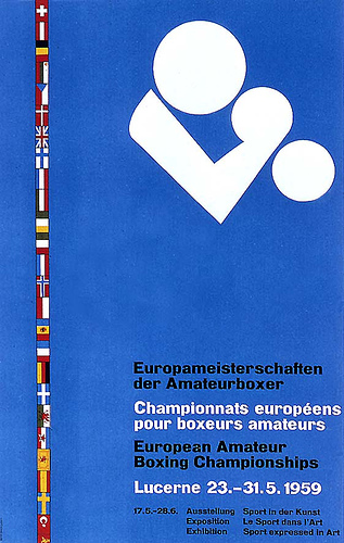
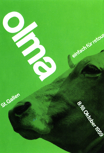
1959
Source: flickr
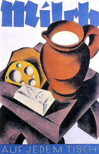
Poster by Joseph Müller-Brockman 1959. If you have ever worked and lived around dairy herds or cattle you come to understand what work really is, and dairy products advertising illustrations that create dancing cows in daisy hats look ridiculous. I prefer this approach.
Americans seem to respond more to eclectic visuals and Europeans seem to respond more to objective visuals. It’s a cultural difference.
Source: flickr
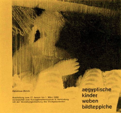
Catalog cover design by Carl Graf, Zürich for an exhibition of tapestries woven by Egyptian children, for the Swiss Museum of Industrial Design 1959. From an old slide but the photograph is correct.
Source: flickr
![]()
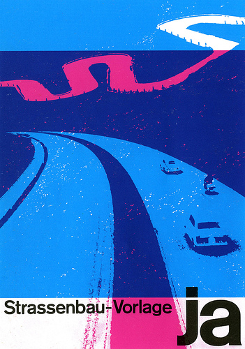
19..
Swiss poster by Joseph Müller-Brockman. It is actually a political poster. And the “river” is a winding road. It’s meant to tell the Swiss population to go and vote a YES for a plan by the government to build Autobahnen in Switzerland.
Source: flickr
![]()
19..
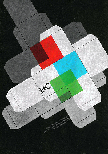
Packaging advertisement by Joseph Müller-Brockman. A New Graphic Design principle stated that drawing for advertising has the purpose of being objective to best serve the reader.
Source: flickr
![]()
19..
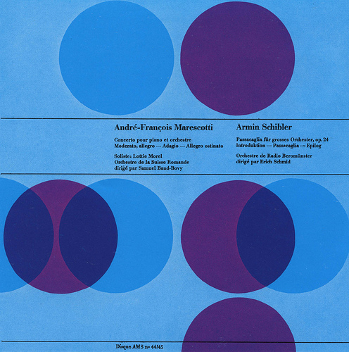
Record case by Joseph Müller-Brockman. This layout, as well as the other Swiss graphic design examples, shows a creative use of color that is an integral part of the design. It also deviates from the use of san-serif to a Roman typeface.
Source: flickr
![]()
19..
Advertisement for a German company by Joseph Müller-Brockman.
Source: flickr
![]()
1960
Swiss graphic designer Josef Muller-Brockman, was one of the great pioneers in the New Graphic Design movement, (also known as Swiss Graphic Design). This two-color poster, designed in 1960, was one of the revolutionary turning points in contemporary graphics. And it was not just another transitory style, it defined a contemporary graphic environment world wide.
Source: flickr
![]()
1961
Source: flickr
Designed by Jean Jucien Ongraro, 1961.
Source: flickr
![]()
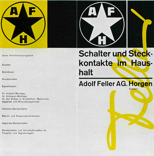
<1962
Cover for a prospectus designed by Richard Lohse, Zürich before 1962. I think that Carlo Vivarelli used Elizabeth Feller’s signature (she was director of Adolf Feller at the time) as the basis for the Feller signature logo.
Source: flickr
![]()
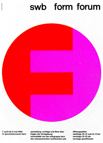
1962
Source: flickr
![]()
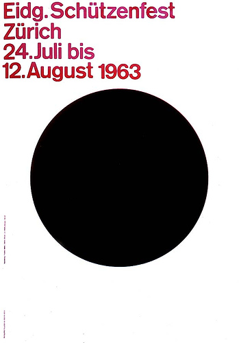
1963
The lettering is out of alignment due to shot over the spine of the book, not part of the design.
Source: flickr
![]()
<1965
Cover of a brochure designed by Richard Lohse before 1965.
Source: flickr
Brochure cover (I think) designed by Richard Lohse before 1965.
Source: flickr
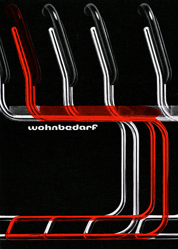
Tube furniture design came from the Bauhaus, among other places, and Wohnbedarf carried the idea to commercial success.
This series of advertisements was designed by Richard Lohse, Zurich designer around 1960.-1
Source: flickr
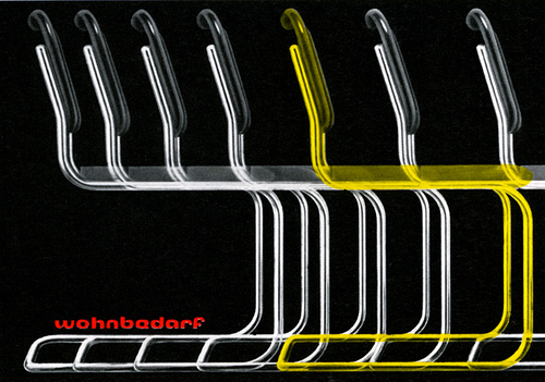
Richard Lohse, Zurich designer around 1960.-2
Source: flickr
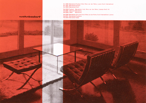
Richard Lohse, Zurich designer around 1960.-3
The years of nationalism and WWII were extremely difficult for this company, as well as for all functional designers who suffered from the retrogressive tendencies of that time, but after the war ended, a new interest swept modern furniture design on to the international market. As they say, the rest is history.
Source: flickr
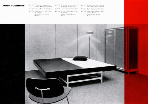
Richard Lohse, Zurich designer around 1960.-4
The Zurich Wohnbedarf firm was a pioneer in furniture manufacturing in Switzerland who started up in 1931, producing pieces of contemporary furniture that were practical, easily handled, well designed and built and sold at moderate prices. (IKEA, were you listening? I’m sure that you were when you started up.) Wohnbedarf’s publicity followed the contemporary design principles of the company. (Gee, the only time that I can ever imagine seeing a bedroom this clean would be in the state penitentiary or the state psychiatric hospital, but I love the simple layout.)
Source: flickr
![]()
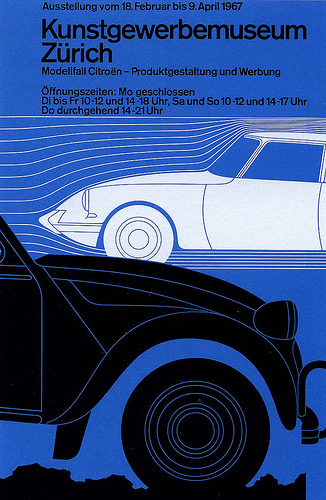
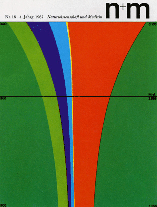
1967
Design by Jorg Hamburger for the Kunstgewerbemusuem, Citroen, Zurich, Switzerland 1967.
Source: flickr
A publication cover for Naturwissenschaft und Medizin designed by Erwin Poell 1967.
Source: flickr
![]()
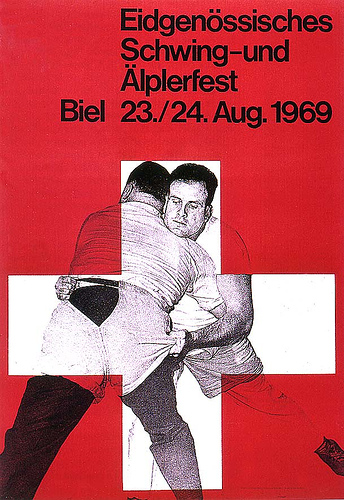
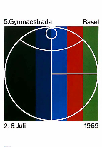
1969
Swiss sports poster, designer Jürg Schaffer 1969.
Schwingen is an old Swiss form of wrestling.
Source: flickr
1969 sports poster design by Herbert Leupin.
Source: flickr
A publication cover for Naturwissenschaft und Medizin designed by Erwin Poell 1969.
Source: flickr
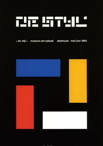
De Stijl exhibition poster designed by Almar Mavignier 1964.
Source: flickr
![]()
1970
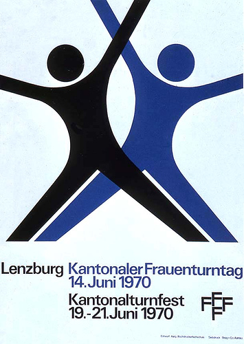
Swiss sports poster designed by Augausche 1970.
Source: flickr
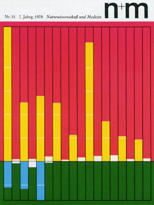
A publication cover for Naturwissenschaft und Medizin designed by Erwin Poell 1970.
Source: flickr
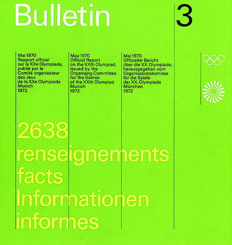
Bulletin designed by Otl Aicher and Rolf Müller 1970.
Source: flickr
![]()
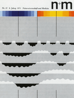
1971
A publication cover for Naturwissenschaft und Medizin designed by Erwin Poell 1971.
Source: flickr
![]()
<1972
All I know about this one is that it was designed by MB+Co, Zürich, sometime before 1972.
Source: flickr
![]()
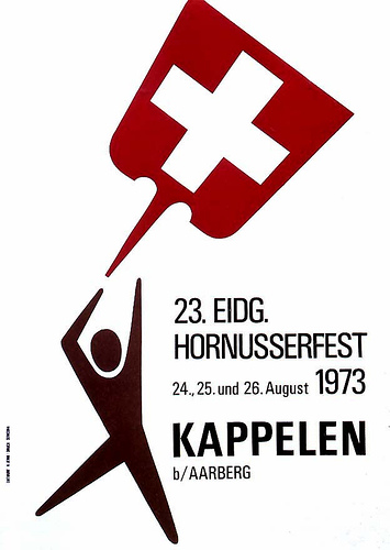
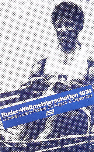
1973
A Swiss Hornusserfest poster, designed by H. Jenni 1973.
Source: flickr
Source: flickr
![]()
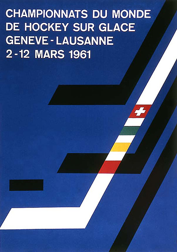
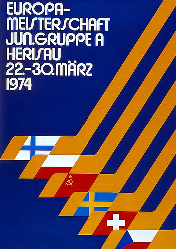
1974
European Junior Icehockey Championships 1974.
Source: flickr
Swiss sports poster designed by Michael Baviera 1974.
Source: flickr
Advico Advertising Agency ad 1974.
Source: flickr
![]()
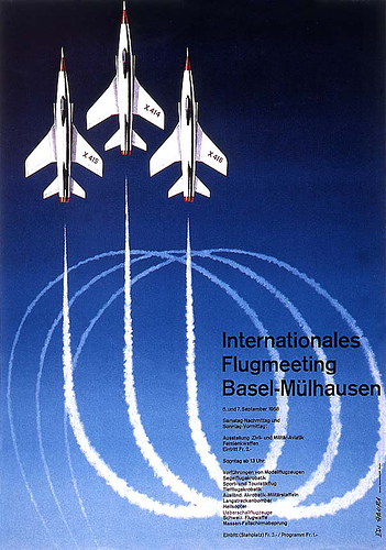
19..
International Swiss air show poster by Edi Hauri.
Source: flickr
Graphics for a Swiss bank, designed by Siegfried Odermatt.
Source: flickr
![]()
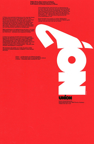
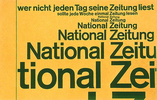
1980
Designed by Visual Communication, Zurich, Switzerland Jörg Zintermeyer, Verena Rudolf around 1980.
Source: flickr
Source: flickr
Source: flickr
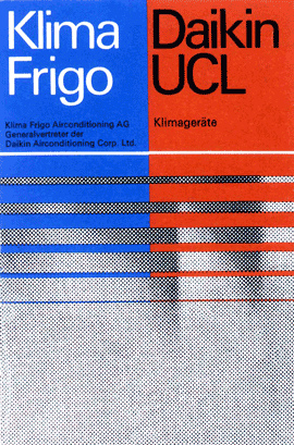
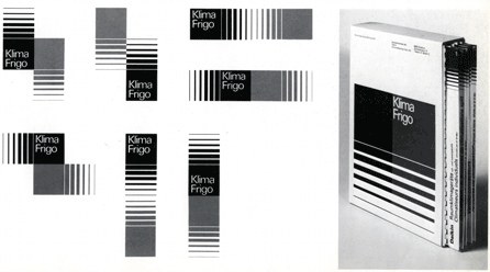
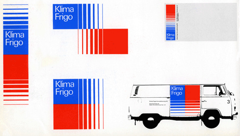
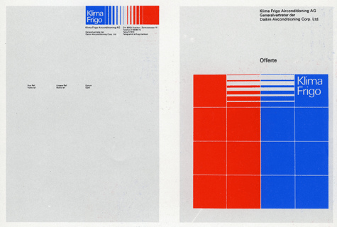
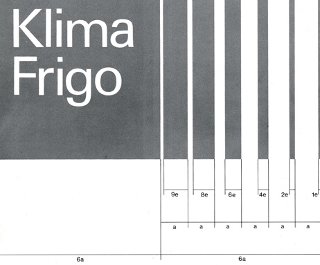
Letterhead (?) and report cover.
Source: flickr
The grid system for the Swiss Klima Frigo air-conditioning firm.
Source: flickr
![]()
Even reprocessed newspaper bundle wrapping was designed in the new typographic style.
Source: flickr
![]()
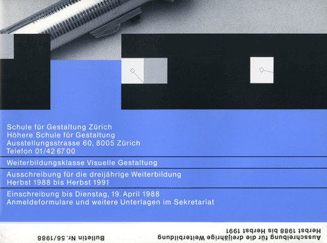
1988
This is the front fold of a large poster that I picked up in Zurich.
Source: flickr
![]()
Note: Komentar dari kolektor (Marryellen, pengajar desain grafis) - yang terkadang tercantum pada deskripsi masing-masing karya - sengaja tidak dihapus, karena bisa merupakan informasi yang berguna untuk melakukan penelitian yang lebih mendalam.
![]()
See also: imagenow
•••
To be continued.


 1. Nirmana: Elemen-elemen Seni dan Desain | Sadjiman Ebdi Sanyoto
 2. Desain Komunikasi Visual Terpadu | Yongky Safanayong
 3. Hurufontipografi | Surianto Rustan
 www.underconsideration.com

[…] History of Swiss Graphic Design 17.762 views […]