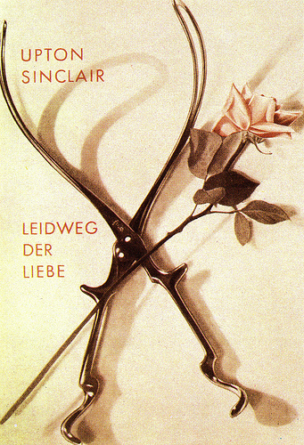
1897
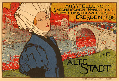
Otto Fischer, Ausstellung, Dresden, 1896
Artist: Otto Fischer, German (1870-1947)
Title: Ausstellung, Dresden, 1896
Printed by Imprimerie Chaix, Paris, 1897.
“While the poster flourished in France, Germany was still ignorant of it’s elementary rules; advertisements were only dreary enlargements of art-school productions, resolutely historical, in the purest style of Bavarian renaissance…The first poster worthy of the name did not appear until1896 for an exposition in Dresden: Die Alte Stadt by Otto Fischer. For the first time the design is graphic, the colours vivid, the lettering skilfully distributed. This vision of a woman in regional costume in the foreground, with the old town in the background, broke completely with the usual allegories” (Weill p.95)
Source: Yaneff.com
![]()
1898
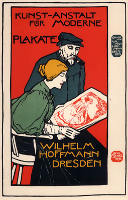
Otto Fischer, Kunst-Anstalt fur Moderne Plakate, 1898
Artist: Otto Fischer, German (1870-1947)
Title: Kunst-Anstalt fur Moderne Plakate
Printed by Imprimerie Chaix, Paris, 1898.
“In 1896, the first year of the Jugendstil, or German Art Nouveau style, Otto Fischer produced this striking poster of a man and a woman engrossed in looking at a large print. No setting is indicated, aside from the woman’s chair, and the focus is entirely on the print which is turned slightly toward the viewer to reveal the image of two girls in a landscape framed by a tree branch…The poster is an advertisement for a printing house, Wilhelm Hoffmann’s Studio for Modern Posters in Dresden. It may have been for that reason that the artist dispensed with the gallery setting so frequent in French posters of people looking at prints, with which he was obviously familiar. The contrast in style between the poster itself and the subordinate image is noteworthy. The former relies on bold colours and flat planes, the latter on more intricate detail Clearly, artists with many diverse styles were encouraged to bring their works to Hoffmann for printing”(Wolfe, 37)
Source: Yaneff.com
![]()
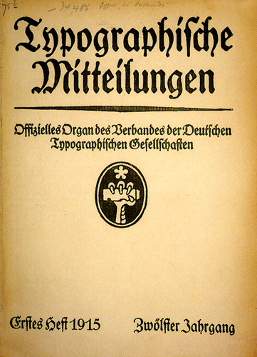
1913
Typographische Mitteilungen was a printers trade journal founded in 1903 in Leipzig, Germany. The magazine followed conventional German typography using Black Letter typefaces. This is what we called “trade graphics” and was usually letterpress production. Visually dull and very conservative, it’s the sort of publication work that I ran into in university publications of the 1960’s.
Source: flickr
![]()
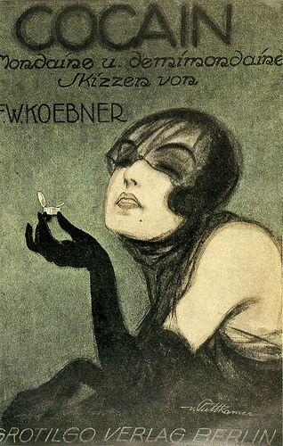
The reality of life in Germany at that time was visualized by graphic arts of a different nature. DaDa had developed out of WWI as an anti-war movement, reflecting the insanity of the times, and other German graphic artists such as George Grosz, created works that were especially bitter. Even Käthe Kollwitz lithographs were turned into poster pleas for food for German children.
Source: flickr
![]()
The great German artist, Käthe Kollwitz, used her lithographic work to promote food drives for German children. The Kaiser’s wife called her work “gutter art”.
Käthe Kollwitz worked as an artist throughout her life in the face of all odds, even the death of her son in WWI and her grandson in WWII.
Source: flickr
![]()
Berlin Dada (1918-1924)
In 1918 Richard Huelsenbeck returned from Zurich to Berlin, bringing Dada with him. Indeed, the beginning of Berlin Dada is generally associated with Huelsenbeck’s reading of the “First German Dada Manifesto” at J. B. Neumann’s gallery on 21 January 1918. Founder members of Berlin Dada include John Heartfield, Wieland Herzefelde, George Grosz, Johannes Baader, Hannah Höch, and Raoul Hausmann.
Berlin Dada’s most distinctive quality, differentiating it from other forms of Dada, was its more aggressive and politically motivated approach to the arts. This was unquestionably due to the fact that the ravages of the first World War and its aftermath had hit Berlin much harder than it had Zurich, in neutral Switzerland. As Dawn Ades states, “Towards the end of the war Berlin was a half-starved nightmare city, and there was increasing social and political chaos, which was to last until 1933″(4).
Berlin Dada was also much more interested in publishing and the mass media, and in transitory works and events than other forms of Dada. The climax of Berlin Dada can be seen as the First International Dada Fair (indeed, the only Dada fair ever), which had the theme “Art is dead! Long live Tatlin!”. All of the major Berlin Dadaists, including John Heartfield and George Grosz exhibited works at the show, whose central piece was a dummy with a pig’s head, hanging from the ceiling, dressed as a German officer. The works involved shocked the general public and created publicity for Dada’s beliefs.
Heartfield’s association with the Berlin Dadaists is not surprising when we see their assertive and political approach to art, which aligned itself with Communist ideals. However, as Peter Selz notes, as
Dada itself remained “a master of the spirit and as such could accept no master, neither the aristocrat nor the proletarian;” … “the more these people were thrown into the revolutionary movement of the proletariat, the more they lost their identity as dadaists”(5)
Such was the case for John Heartfield, as he moved away from Berlin Dada and strengthened his commitment to Communism. Heartfield’s associations with Dada were nevertheless very important ones, and are identifiable in much of his later work.
Source: Berlin Dada
DaDa Artist:
Source: DaDa online
![]()
A book cover designed by John Heartfield, the adopted name of Helmut Herzfelde, who had served two years in the German military, WWI. He was also a founding member of the Berlin DaDa in 1919. He was a successful graphic artist who combined photography, type and other visual effects into photomontages that fought the corruption of the Weimar Republic and the rising Nazi movement.
Source: flickr
![]()
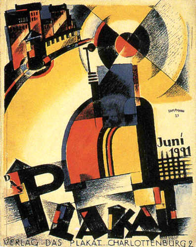
1921
The publication Das Plakat (The Poster) cover by Walter Kampmann 1921.> This publication used the graphics of both conventional and avant-garde designers, and was a very contemporary influence on publication design between 1910 and 1921.
Source: flickr
Another publication of Das Plakat (The Poster) 1921.
Source: flickr
![]()
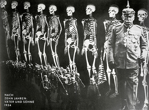
1924
Photomontage by John Heartfield 1924. ‘After Ten Years, Fathers and Sons’.
Source: flickr
![]()
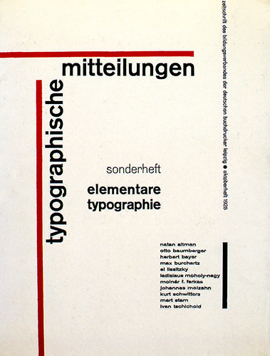
1925
Jan Tschichold’s re-design of the German Printers Association journal. He had been invited to showcase his collection of contemporary graphics and he went the whole way, even redesigning the cover and inside layout, much to the shock of the editors.
Source: flickr
The new typography and graphic design suddenly took on a dangerous side in Germany, as so much of the Communist and socialist publication material was avant-garde for that day, and many of the designers had leftist sympathies. It was especially so for the Jewish graphic designers.
The Nazi government did not look lightly on Die Neue Typographie.
Source: flickr
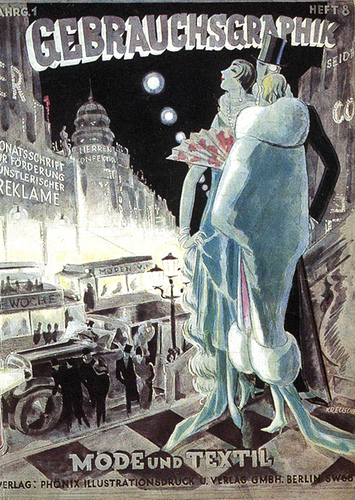
Mode und Textil issue cover designed by Kreuscher August 1925.
Source: flickr
![]()
1926
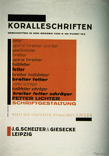
A printer’s sample sheet for the Koralle type family designed by Herbert Bayer 1926..jpg
Source: flickr
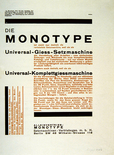
An advertisement for Monotype and it’s Universal setting machine, designed by Herbert Bayer 1926.
Source: flickr
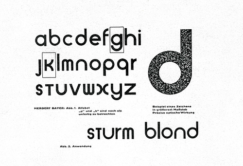
Sample of the Universal alphabet by Herbert Bayer, Bauhaus teacher and graphic designer (1926), described as the Bauhaus style.
Source: flickr
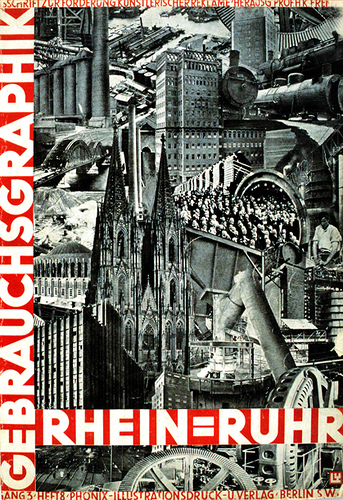
The photomontage. Gebrauchsgraphik cover design by LY, September 1926.
Source: flickr
![]()
1927
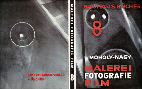
Dust jacket for the book Painting Photography Film designed by Bauhaus teacher and graphic designer, Moholy-Nagy 1927.
Source: flickr
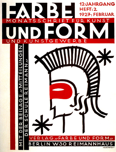
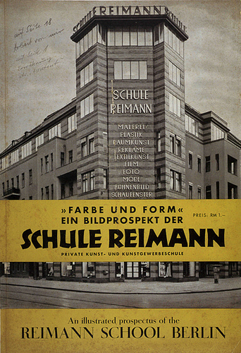
Poster designed by Max Hertwig, commercial graphics teacher at the Berlin Reimann school 1927.
Source: flickr
Albert Reimann’s 1927 monthly review cover for the Arts and Crafts at the Reimann school, using Rudolf Koch’s Neuland typeface for German as well as using a Roman typeface for English.
Albert and Klara Reimann founded the Reimann school in Berlin and by 1914 had developed a successful vocational curriculum that trained students not so much for the Arts and Crafts Movement, but for the design aspects of the commercial world. Graphics for printing, window display, stage design, fabric design, and fashion-related classes were offered.
The Bauhaus school, founded by Walter Gropius, came into existence after WWI with concepts that differed from the existing design related German schools and took a different direction in its curriculum.
Source: flickr
![]()
1928
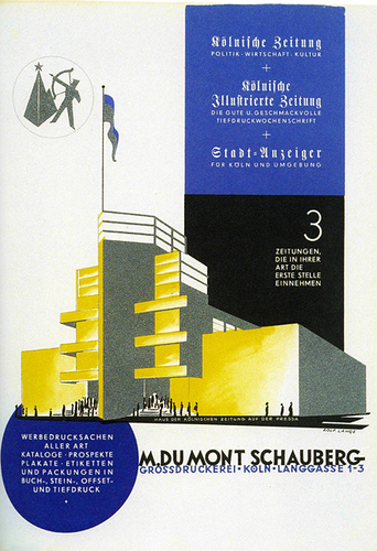
Rolf Lange designed this advertisement for the publisher M. Du Mont Schauberg for Pressa, the International Press Exhibition held in 1928 in the Deultz neighborhood of Cologne, Germany.
Source: flickr
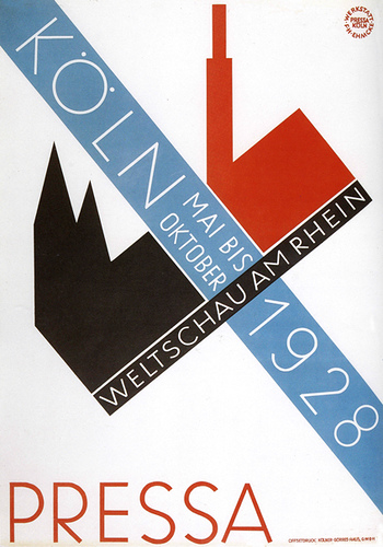
A Renå Binder and Max Eichheim design through the Ehmcke workshop. A poster for the International Press Exhibition called Pressa, Cologne, Germany 1928.
Source: flickr
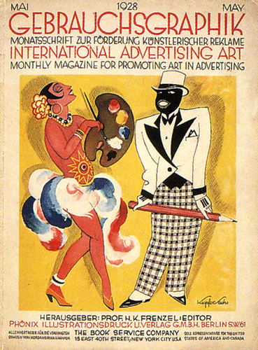
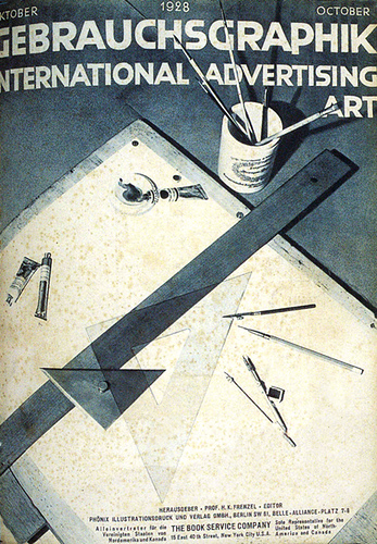
Gebrauchsgraphik May 1928 cover designed by Wilhelm Willrab.
Source: flickr
The Gebrauchsgraphik covers were never all in the same design orientation, each edition used a very different approach. Cover designed by Uli Huber, October 1928.
Source: flickr
![]()
1929
Typefoundry booklet designed by Herbert Bayer 1929, a year after he had resigned from teaching at the Bauhaus and was working for the Dorland Advertising Agency. This is the time period when advertising agencies were beginning form, grow and become international.
Source: flickr
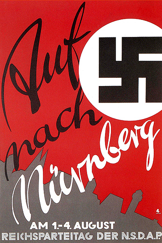
Poster designed by Scheller 1929. ‘Go to Nuremberg!’ (The power of graphic design.)
Source: flickr
![]()
1930
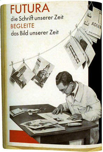
Announcement for Paul Renner’s typeface Futura 1930. The photomontage, a new graphic form. No PhotoShop back then. It was cut and paste.
There was a European Futura and then a slightly different Futura designed by Paul Renner for sales in the US. There are also innumerable copies with different names and slight changes to get around the copyright, all based on Futura. Phototypesetting companies that came later were the most notorious in this practice. If you use Futura, make sure that is the original face. It sets much better than the plagiarized copies.
Announcement for Paul Renner’s typeface Futura 1930. (inside pages)
Announcement for Paul Renner’s typeface Futura 1930. (back cover)
Source: flickr
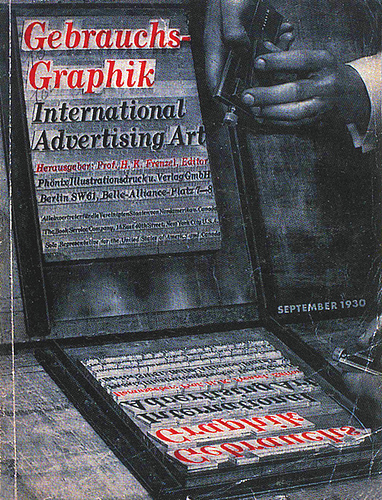
Professor H K Frensel founded Gebrauchsgraphik in 1923 and it became one of the most popular international advertising design journals of that time. Published in both German and English, it followed Dr. Frenzel’s concept that advertising should be a positive force in society and he followed what was developing with work influenced by Futurism, Constructivism, DeStijl and the Bauhaus, as well as other innovative graphics. The magazine never espoused any specific philosophy but was open to all design directions that related to the highest standards.
This is one of my all-time favorite Gebrauchsgraphik covers, illustrating a reflection of traditional letterpress metal hot type and the compositor’s stick. This is why I had so much trouble designing for letterpress. There was always that middle man that you had to deal with, the compositor. Back in the days when leading really meant a piece of lead between the lines of type.
Source: flickr
Herbert Bayer, the German master graphic designer, who both attended and taught at the Bauhaus, had been freelancing and working on his own when war seemed inevitable. He migrated to the United States where he became a very successful graphic designer.
Source: flickr
![]()
After serving in the German army during WWI, Herbert Bayer (born 1900 in Austria) enrolled in an arts and crafts studio, then worked for a designer. In 1921 he studied at the Weimar Bauhaus and then taught there, starting in 1925, teaching typography & advertising effects. Bayer then worked full-time for advertising agency Dorland International and as art director for Vogue magazine.
In 1938 Bayer emigrated to the US and worked in New York until 1946 for such clients as Dorland International, Thompson, Wanamaker’s, and developing exhibitions and general graphic design for large corporations.
In 1946 He moved to Aspen, Colorado and continued as consultant to firms such as Container Corporation of America.
Source: flickr
![]()
1931
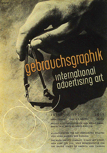
Photography and graphic design, Gebrauchsgraphik. Cover designed by Stephan Schwarz July 1931.
Source: flickr
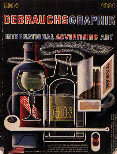
Unknown artist, Gebrauchsgraphik cover, November 1931.
Source: flickr
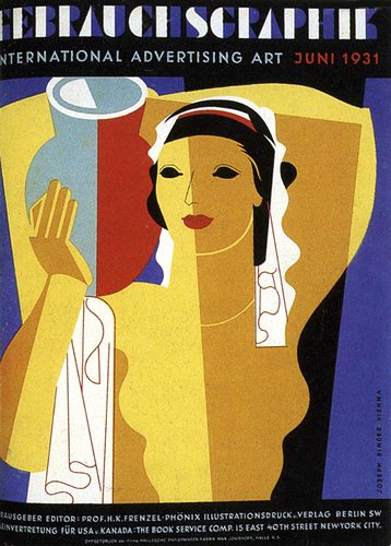
Gebrauchsgraphik cover design by Joseph Binder, June 1931.
Source: flickr
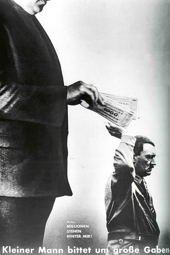
John Heartfield and his brother constantly put their lives on the line to “tell it like it is”. This is “Millions stand behind me”. Photomontage magazine cover designed by John Heartfield 193I.
It is ironic that those millions came from international industralists and banking firms across Europe, and among those were IG Farben and also many Americans such as Henry Ford and George Bush’s grandfather. Without that money there would have never been WWII.
Source: flickr
![]()
1932
Fractur was now the most popular typeface for the German Nazi party. Nazification of typography.
Source: flickr
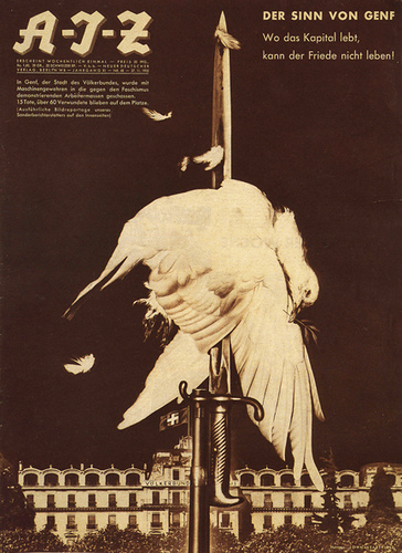
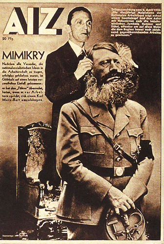
Magazine cover designed by John Heartfield 1932. ‘The Meaning of Geneva’.
Source: flickr
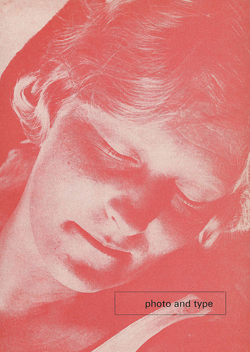
Front page of an invitation to participate in a photo and type competition sponsored by the Munich section of the German Compositors’ Association, 1932. Jan Tschichold.
Source: Swiss Legacy
Joseph Binder, poster for the Quality League Settlement in Vienna 1932. He was asked which one of his designs was his favorite and his reply was “the design that I have just taken off the drawing board is always my favorite”.
Source: flickr
An ad designed by Walter Brudi promoting wool. This one of the very first examples of the International Style that I have found from Germany. It’s time period is 1932. I think that the headings are in Futura, a san-serif type face by Paul Renner.
Source: flickr
Front page of an invitation to participate in a photo and type competition sponsored by the Munich section of the German Compositors’ Association, 1932. I am not too sure, but I think that this is a Jan Tschichold design and that he made an English language print too.
Source: flickr
![]()
1933
This is as close as I can come to uploading a precise image from Gebrauchsgraphik to show how the magazine used Futura in all of it’s typography for it’s internal design and layout until around 1937. It was different for the design of the covers where the whole layout and choice of type changed from issue to issue.
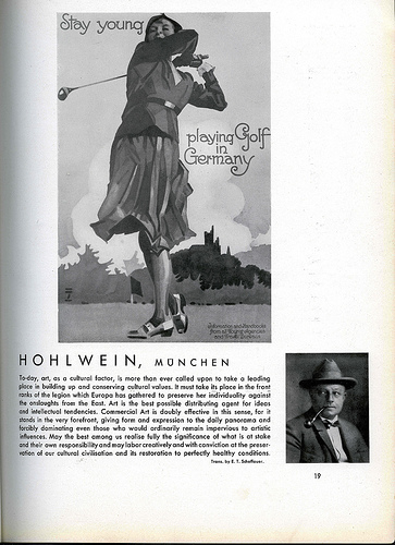
This article by Ludwig Holwein is from one of my 1933 issues of Gebrauchsgraphik. He produced very popular posters for many different German agencies and since Germany was undergoing the Great Depression (along with the rest of the world) his work promoting German tourism was especially in vogue at that time. (Anything to get money circulating in Germany.)
The article also had other Holwein illustrations but all in black and white, not in the full color that they were originally published in.
Source: flickr
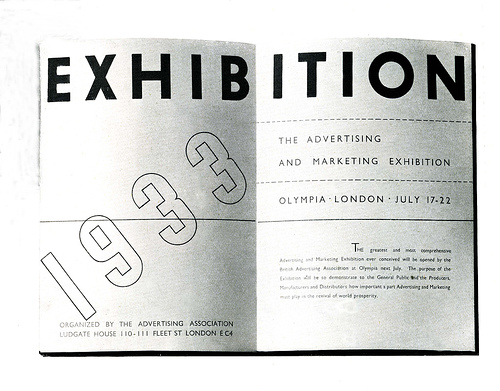
Ashley Havinden was the designer of this prospectus for the Advertising and Marketing Exhibition in London 1933. (Up until the late 1950’s graphic design was called advertising art.) In 1957 I remember my design teacher using this booklet as an example of the best in contemporary page layout.
Source: flickr
This is a small, interesting ad by Walter Brudi for wool, from a 1933 German advertising art publication. The use of photography, layout and san-serif letterforms is a very early example of the international style
Source: flickr
Design by Caspar Neher 1933. I think that the typeface is Futura.
Source: flickr
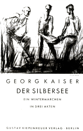
Book jacket and spine title designed by Jan Tschichold, 1933.
Sopurce: flickr
![]()
1934
Magazine cover designed by John Heartfield, I think 1934..
Source: flickr
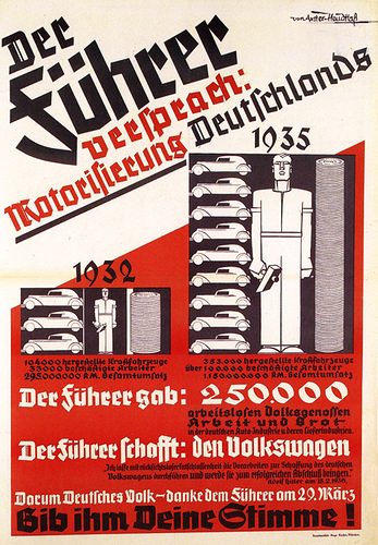
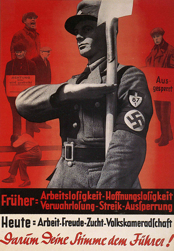
Nazi voting poster 1934. ‘Before, unemployment. Therefore give your vote to the Führer!’
Source: flickr
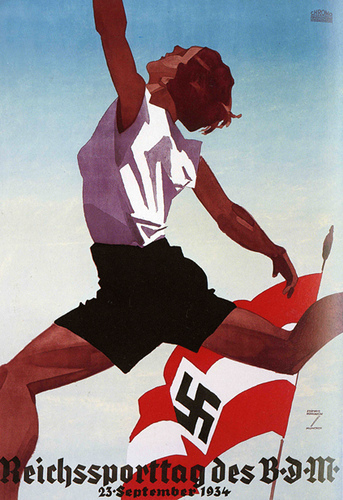
Pictorial Modernism poster designed by Ludwig Hohlwein 1934. The Reich Sports Day of the Association of German Girls.
Source: flickr
![]()
1935
Herbert Bayer, the German master graphic designer, who both attended and taught at the Bauhaus, had been freelancing and working on his own when war seemed inevitable. He migrated to the United States where he became a very successful graphic designer.
Source: flickr
Tannenberg, the successful German fractur typeface designed by Konrad Jochheim 1935.Tannenberg, the successful German fractur typeface designed by Konrad Jochheim 1935.
Source: flickr
![]()
1936
Catalog cover designed by Herbert Bayer 1936, not too long before he left for the US. The letterform, the square format, the artwork all go a far different direction that what was popular graphics for Germany at that time.
Source: flickr
![]()
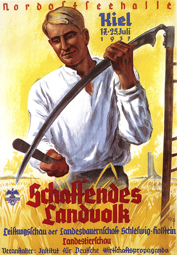
1937
Pictorial propaganda. Once more the glamorization of the national in the idealized poster, following a format that had been used in Germany extensively during WW1. Designed by Anto Poster 1937. Graphic design following the party line.
Source: flickr
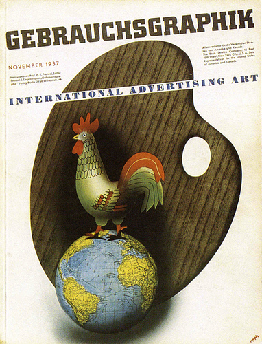
1937, the year that Professor Frenzel, founding editor and guiding light for Gebrauchsgraphik, was killed in an automobile accident. The magazine discontinued during the war but was later revived.
I wish that I knew more about the details of his death. Perhaps there is no official information. Those were very difficult times in Germany.
Source: flickr
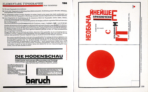
Jan Tschichold, designer, whose pioneering work in understanding and using typography set new standards for the twentieth century.
Source: flickr
![]()
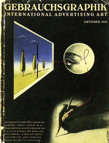
1938
Gebrauchgraphik cover design by Herbert Bayer 1938.
Gebrauchgraphik text had been set in Futura typeface up until the magazine came under the control of the Subject Group for Commercial Graphic Designers, a government department, following the centralization of control of cultural production in the Third Reich. After that, any article concerning the National Socialist (Nazi party) legislation would be set only in German and in Fraktur.
Source: flickr
![]()
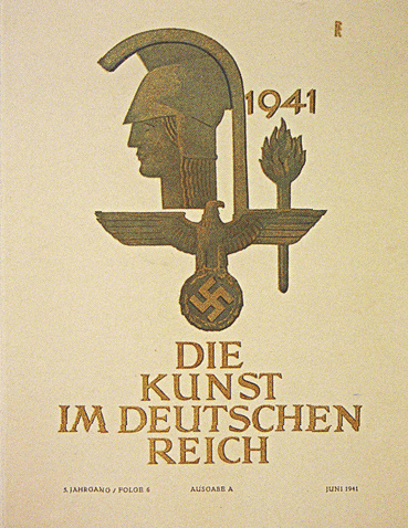
1941
Wartime design for the Reich (1941) and now it’s traditional, classic typography. By then fractur was forbidden.
Source: flickr
![]()
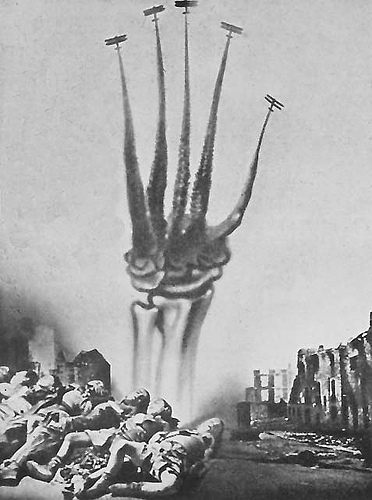
This is a John Heartfield photomontage protesting war. He was forced to flee from Germany to England when Nazi storm troopers raided his studo. After WWII he lived in East Germany and produced many works protesting the Vietnam War that I don’t think have ever been shown in the US.
John Heartfield, his brother Weiland Herzfelde, and George Grosz were also founding members of the Berlin DaDa movement.
![]()
19..
Poster for National Museum of Munich.
Source: flickr
![]()
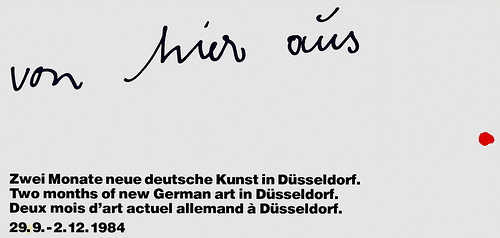
1984
Cover of a folder announcing new German art in Düsseldorf, Germany 1984.
Source: flickr
![]()
1988-90
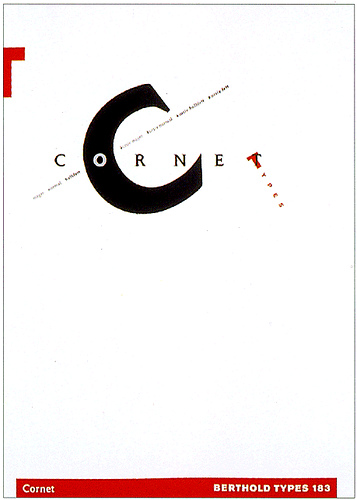
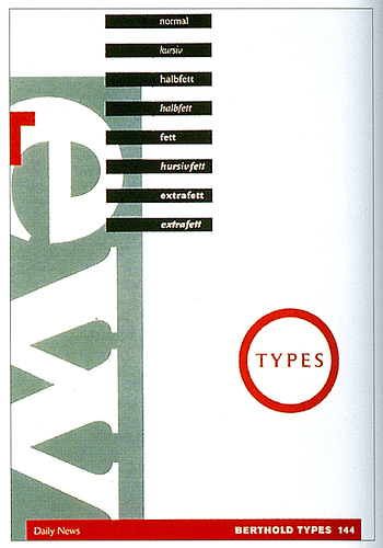
Designed by Eric Spiekermann/Meta Design for Berthold AG. 1988-90. He was also one of the founders of FontShop.
Source: flickr
Designed by Eric Spiekermann/Meta Design for Berthold AG. 1988-90. He was also one of the founders of FontShop. Eric Spiekermann’s typography is superb! All graphic design students should study his work and concepts of typography.
ßource: flickr
![]()
2001
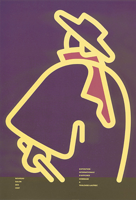
Designer: Nico Ott & Bernhard Stein, German
Title: Nouveau Salon des cent, Hommage a Toulouse-Lautrec.
Printed in Paris, 2001.
Source: Yaneff.com
![]()
Note: Komentar dari kolektor (Marryellen, pengajar desain grafis) - yang terkadang tercantum pada deskripsi masing-masing karya - sengaja tidak dihapus, karena bisa merupakan informasi yang berguna untuk melakukan penelitian yang lebih mendalam.
•••
To be continued.


 1. Nirmana: Elemen-elemen Seni dan Desain | Sadjiman Ebdi Sanyoto
 2. Desain Komunikasi Visual Terpadu | Yongky Safanayong
 3. Hurufontipografi | Surianto Rustan
 www.underconsideration.com

Thank you. You’re the only one with real information about Otto Fischer. It’s hard to find something about him. Even in German!
you’re welcome R.A.
Thank You very much for those old scans of Futura!!!
you’re welcome dd.
This is absolutely fascinating stuff. Thank you so very much for putting this online.
you’re welcome mage balley
[…] History of German Graphic Design 22.380 views […]
What a material of un-ambiguity and preserveness of precious knowledge about
unexpected emotions.